
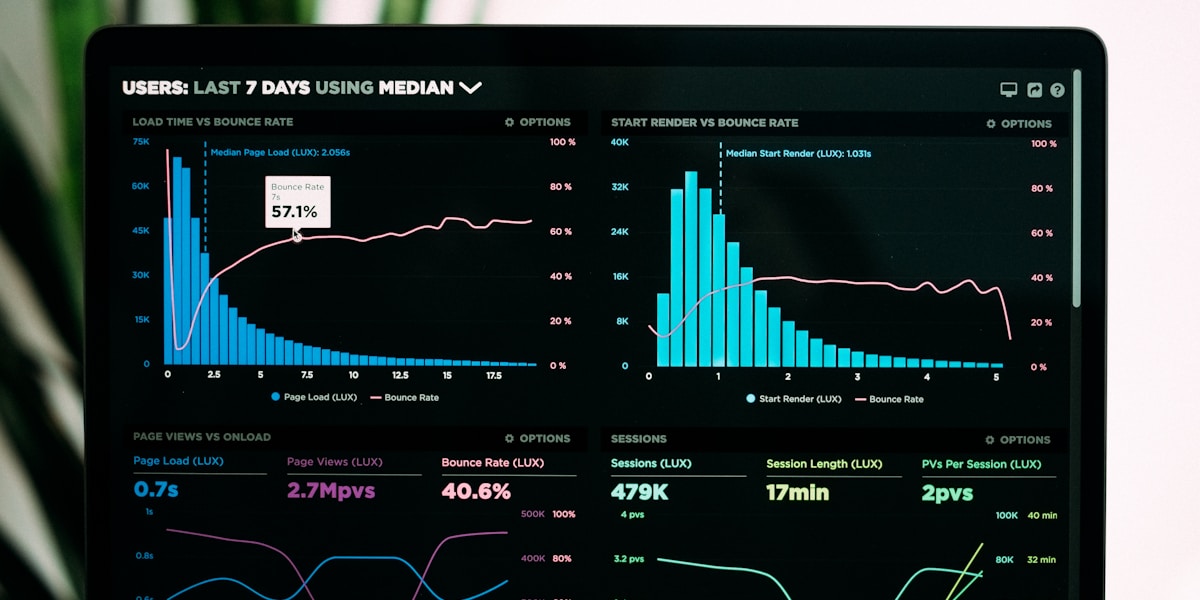
Introduction: The Visual Data Revolution
In today's information-saturated world, the ability to communicate data effectively has become more critical than ever. While raw numbers and statistics have their place, the human brain processes visual information 60,000 times faster than text. This simple fact has driven the explosive growth of infographics and data visualization tools—and in 2025, artificial intelligence is taking this revolution to unprecedented heights.
The challenge facing businesses, content creators, and tech bloggers is clear: how do we transform complex data into compelling visual stories that capture attention and drive understanding? Enter AI-powered infographic tools, which are fundamentally changing how we create, customize, and communicate through visual data.
How Generative AI Has Transformed Infographic Creation
Generative AI has democratized the world of data visualization in ways unimaginable just a few years ago. What once required hours of design work, specialized software knowledge, and a keen aesthetic eye can now be accomplished in minutes with AI assistance.
Speed and Efficiency
Traditional infographic creation could take designers anywhere from several hours to days. AI-powered tools can now generate professional-quality infographics in minutes, analyzing your data, selecting appropriate chart types, and applying design principles automatically.
Intelligent Insights
Modern AI doesn't just visualize your data—it understands it. These tools can identify trends, correlations, and anomalies in your datasets, suggesting the most impactful ways to present your findings. They can recommend which data points deserve emphasis and which visualization types will communicate your message most effectively.
Customization at Scale
AI enables unprecedented personalization. These tools can adapt visual styles to match your brand guidelines, adjust color schemes for accessibility, and even generate multiple variations of the same infographic optimized for different platforms—from Instagram squares to blog headers.
Leading AI Infographic Tools in 2025
🎨 Canva Magic Design
Canva's AI-powered Magic Design has evolved into a sophisticated infographic generator. Simply input your data or describe your concept, and the tool generates multiple design options instantly. Its strength lies in its intuitive interface and vast template library, making professional design accessible to everyone.
📊 Powerdrill Bloom
Specializing in data-heavy visualizations, Powerdrill Bloom excels at transforming complex datasets into clear, interactive infographics. Its AI can process spreadsheets, databases, and even natural language descriptions to create stunning visual representations.
📈 Infogram
Infogram has embraced AI to help users choose the right chart types for their data automatically. Its intelligent suggestion engine analyzes your information and recommends the most effective visualization methods, whether that's bar charts, maps, timelines, or custom illustrations.
🎯 Visme
Visme's AI assistant helps create everything from simple charts to comprehensive visual reports. What sets it apart is its ability to generate cohesive visual narratives, suggesting not just individual graphics but entire presentation flows that tell compelling stories with data.
Real-World Impact and Recent Trends
The adoption of AI-powered infographic tools has accelerated dramatically in 2025. Marketing teams report 70% faster content creation cycles, while educational institutions are using these tools to make complex concepts more accessible to students.
Social media analytics show that posts featuring AI-generated infographics receive 3x more engagement than text-only content. Tech companies are using these tools to communicate product features, explain technical concepts, and visualize user data in annual reports.
The journalism industry has particularly benefited, with newsrooms using AI infographic tools to quickly visualize breaking news data, election results, and economic trends in real-time.
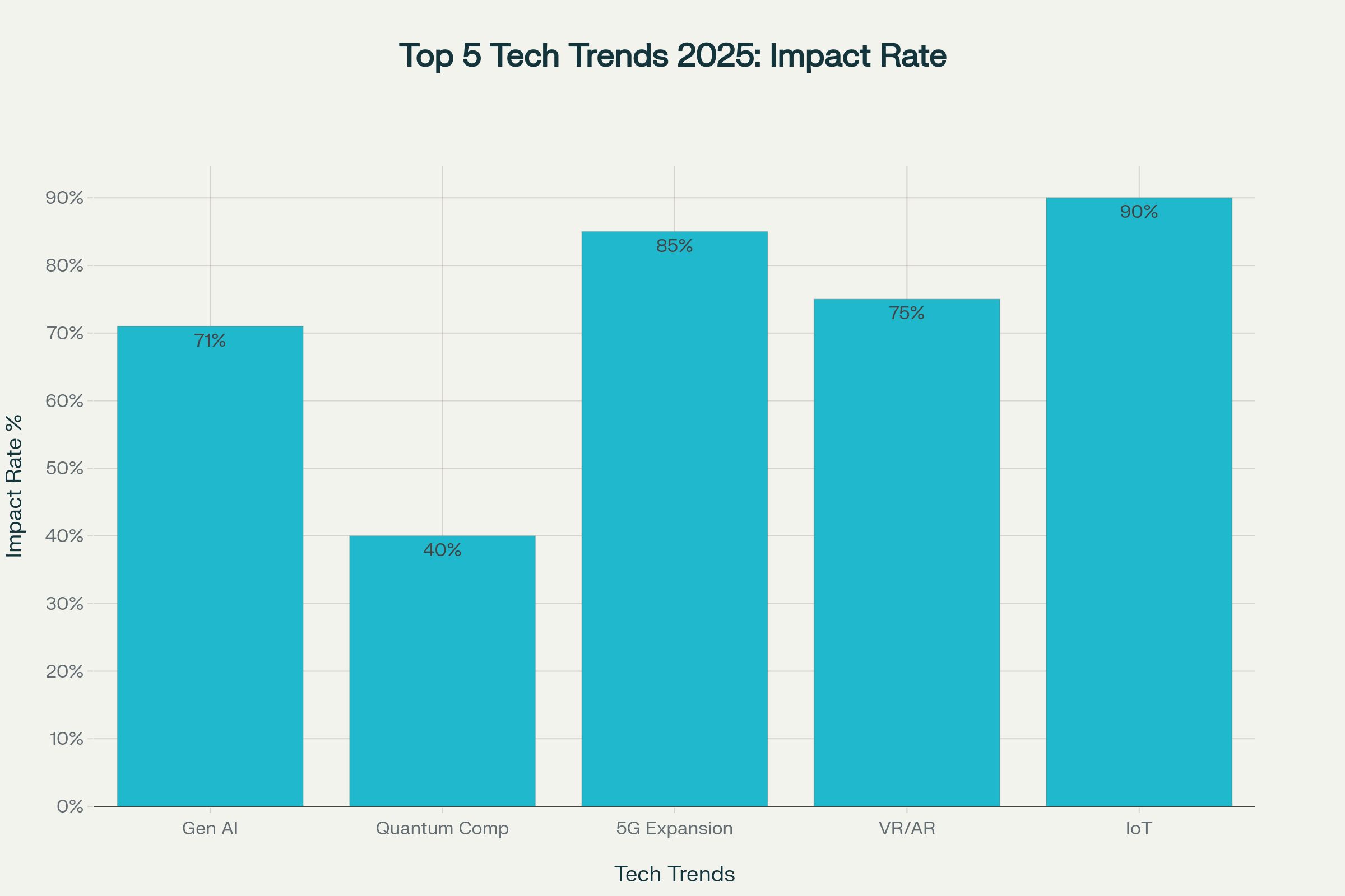
Top 5 Technology Trends for 2025: Impact & Adoption Rate
Why AI-Powered Visual Storytelling Is Essential for Indian Tech Creators
For tech bloggers and content creators in India, AI-powered infographics have become indispensable for several critical reasons:
🎯 Cutting Through the Noise
With millions of blogs and social media posts going up daily across India, your content needs to grab attention instantly. A colorful, well-designed infographic stops people mid-scroll. In a market as competitive as India's digital space, this visibility is gold.
🧠 Simplifying Complexity for Diverse Audiences
Not everyone reading your blog is a computer science graduate from IIT. Your audience might include small business owners in tier-2 cities, students from vernacular medium schools, or professionals from non-tech backgrounds. AI infographics help you explain blockchain, machine learning, or cryptocurrency in a way that makes sense to everyone—from a Sharma ji in Indore to a Reddy aunty in Visakhapatnam.
🚀 Boosting SEO and Regional Reach
Google loves rich media content, and so do Indian readers. Infographics increase the time people spend on your page, reduce bounce rates, and get shared more on WhatsApp groups (yes, that's huge in India!). More shares mean more backlinks, which means better rankings. This is particularly important for reaching audiences across India's diverse linguistic and regional landscape.
💼 Building Trust and Authority
When your blog has professional-looking data visualizations, readers take you seriously. It shows you've done your homework and care about presentation. This is crucial for building a loyal audience in India's trust-driven market, where credibility can make or break a creator's success.
🔮 Staying Ahead in India's Creator Economy
The Indian digital ecosystem is evolving rapidly, with the creator economy projected to reach $24 billion by 2027. Bloggers and creators who embrace AI tools today will have a significant advantage tomorrow. As these tools get smarter with predictive analytics and personalization, early adopters will be miles ahead.
Common Pitfalls and Challenges to Watch Out For
While AI-powered infographic tools are revolutionary, they're not without their challenges. Here's what Indian creators need to be aware of:
⚠️ Over-Reliance on Automation
AI can generate beautiful visuals, but it doesn't understand your unique audience like you do. The biggest mistake creators make is accepting AI-generated infographics without customization. Always review, refine, and add your personal touch to ensure the content resonates with your specific readers.
⚠️ Data Accuracy Issues
AI tools can sometimes misinterpret data or create visualizations that are technically incorrect. Always double-check your data sources and verify that the AI has represented your information accurately. This is especially important when dealing with statistics about the Indian market, where regional variations matter significantly.
⚠️ Cultural Context Matters
Most AI tools are trained primarily on Western data and design aesthetics. What works in New York might not resonate in Nagpur. Ensure your infographics consider Indian cultural preferences, festivals, regional sensitivities, and local context. Color choices, symbols, and visual metaphors should feel familiar to your Indian audience.
⚠️ Internet Connectivity and Access
Many advanced AI tools require stable internet connections and can be resource-intensive. In India, where connectivity can be inconsistent outside major metros, this can be a real challenge. Consider offline capabilities or lighter alternatives when working from areas with limited bandwidth.
Practical Tips for Beginners: Getting Started with AI Infographics
Ready to dive in? Here's a step-by-step guide for Indian creators just starting with AI-powered infographic tools:
🎯 Start with Free Tools
Begin with Canva's free tier or Visme's basic plan before investing in premium subscriptions. These platforms offer enough features to learn the ropes and create compelling content without financial pressure. Once you're comfortable and seeing results, upgrade to access advanced AI features.
📚 Focus on Your Niche First
Don't try to create infographics for every topic. If you're a fintech blogger, master financial data visualization first. If you cover education technology, focus on creating compelling visuals for learning statistics and EdTech trends. Specialization builds expertise faster.
🔄 Create Templates for Consistency
Develop 3-5 template styles that align with your blog's brand identity. This ensures visual consistency across your content while saving time. Include your blog colors, fonts, and logo placement in these templates.
📊 Learn Basic Data Visualization Principles
Understand when to use bar charts versus pie charts, how to avoid misleading visualizations, and which chart types best communicate specific data relationships. Resources like Storytelling with Data offer excellent foundations.
🎨 Study What Works in Your Community
Analyze successful Indian tech blogs and social media accounts. What infographic styles get the most shares and comments? Adapt these proven patterns to your content while maintaining your unique voice.
💡 Optimize for Mobile First
Over 70% of Indian internet users access content primarily via smartphones. Ensure your infographics are legible on small screens, with large text, clear visuals, and simple layouts that don't require zooming.
The Future: What's Next for AI-Powered Data Visualization in India
Looking ahead, the evolution of AI infographic tools will bring exciting developments particularly relevant to Indian creators:
🌐 Multilingual AI Design
Expect AI tools to offer seamless creation of infographics in Hindi, Tamil, Bengali, and other Indian languages. This will democratize content creation for regional language creators and help bridge the digital divide.
🤖 Voice-to-Infographic Technology
Imagine describing your data in Hindi or English, and AI instantly generates a polished infographic. This technology is already in beta testing and will be game-changing for creators who think better verbally than through spreadsheets.
📱 Real-Time Social Media Optimization
Future AI tools will automatically adapt your infographics based on real-time engagement data, testing different versions and learning which visual styles resonate best with your specific audience on different platforms.
🎯 Hyper-Personalization for Regional Markets
AI will soon create different versions of the same infographic optimized for different Indian regions, considering local preferences, cultural nuances, and even festival calendars automatically.
Conclusion: Embracing India's Visual-First Future
Friends, the integration of AI into infographic creation isn't just some foreign trend—it's becoming the backbone of successful digital content in India. Whether you're blogging from a co-working space in Mumbai, your home office in Chandigarh, or a college hostel in Varanasi, the message is clear: embrace these tools or get left behind.
The barriers to creating stunning visualizations have crashed. With AI handling the technical stuff, we can focus on what truly matters—finding meaningful stories, creating engaging content, and connecting with our diverse Indian audience across languages and regions.
As we move deeper into 2025, the question isn't whether to use AI-powered infographic tools—it's how fast you can make them part of your content workflow. The future of data communication in India is visual, intelligent, and powered by AI. And trust me, that future has already arrived at our doorstep!
💡 Key Takeaways for Indian Creators:
- AI infographic tools save up to 70% time—crucial for solo creators
- Visual posts get 3x more engagement—essential in India's visual-first social media culture
- Top accessible tools: Canva Magic Design, Powerdrill Bloom, Infogram, Visme
- Start with free tiers, focus on your niche, and optimize for mobile viewing
- Watch out for data accuracy, cultural context, and over-automation
- Future features include multilingual support and voice-to-infographic technology
- Essential for staying competitive in India's booming $24B creator economy
🙏 Thank you for reading! If you found this helpful, share it with your fellow creators. Let's grow together in this exciting digital Bharat!
📧 Got questions or want to share your experience with AI tools? Drop a comment below—I'd love to hear from you!
References & Further Reading:
- Storytelling with Data - Cole Nussbaumer Knaflic
- India's Creator Economy Report 2025 - RedSeer Consulting
- AI in Content Creation: 2025 Trends - Content Marketing Institute
- Visual Content Engagement Statistics - HubSpot Research